After a two-year break, the students are reviving the cherished tradition of the Kölner Klopfer. This year, a small group of students is not only bringing the award back but also creating a fresh visual identity for it.
A central element of this revival is giving the Klopfer a distinct visual identity. In the past, the design of the Kölner Klopfer was inspired by the year’s recipient, leaving the award without a consistent visual signature of its own. By establishing a dedicated identity, the students aim to ensure the tradition’s continuity for years to come.
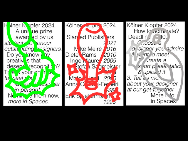
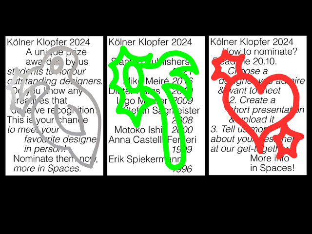
In response to popular demand, the team moved away from the old “Urklopfer” design, while maintaining the playful and ironic spirit that has long characterised this student-organised award. The new visual identity centers around symbols associated with “knocking.”
After experimenting with different ideas, sketches, and materials, the students chose five symbols to represent the new Klopfer: the popular Klopfer Shots, a hammer, a woodpecker, a heartbeat, and the traditional academic hand knock.
The design process for the posters heavily emphasized the use of analog tools, driven by a desire for vibrant colors. To keep the symbols at the forefront, the students opted for minimal typography and clean designs. The final posters feature clean, reduced typography overlaid with hand-drawn, colourful symbols, ensuring each poster is unique.
The team has been documenting the process with short behind-the-scenes videos and regular updates on Instagram, allowing them to promote the event on social media.
Currently in the nomination phase, which ends on October 20th, the students are planning a gathering on the evening of the 23rd October.
There, students will share their nominations and vote for the next winner while enjoying freshly baked pizza and cold drinks.